

Remedify
web app development project | case studyrole: graphic designer, lead motion designersep 2024 — dec 2024
what is remedify?
Remedify is a mobile medication reminder and information app that leverages AI technology to help users manage complex medication schedules, providing customizable reminders and detailed drug information, ultimately enhancing health outcomes and reducing the risks associated with non-adherence.
development tools used: Expo/React Native, Kitten UI, Azure cloud functions & blob storage, Azure Computer Vision (OCR), OpenAI GPT-4o mini, Canadian Drug Product Database (DPD)
design tools used: Adobe Illustrator, Adobe Photoshop, Adobe After Effects, Adobe Premiere Pro, Adobe InDesign, Figma, Storyboarder

demo prototype

the problem
Medication adherence remains a significant challenge, with patients managing chronic illnesses taking only about 50% of their prescribed medications. Misunderstanding instructions affects over 60% of patients after doctor visits, while forgetfulness leads to missed doses for nearly half (49.6%). Addressing these issues is essential to improving health outcomes and reducing risks associated with non-adherence.
remedify's solution
Medication adherence is improved through structured schedules that reduce confusion and missed doses. Clear explanations provide essential details about each medication, including its purpose and proper usage. Smart reminders send timely alerts to ensure consistent intake, helping users stay on track with their treatment and manage their health more effectively.
remedify's target audience

cognitively impaired
Remedify’s intuitive reminders help users with cognitive challenges remember their medications, supporting confidence, education, and routine.
polypharmacy & caregivers
Remedify’s intuitive reminders help users with cognitive challenges remember their medications, supporting confidence, education, and routine.

features
AI-powered label scanning
Easily scan your medication labels to set up reminders automatically, minimizing the steps you need to remember and simplifying the process.

One-tap
medication logging
Easily log each dose with a single tap and track medications effortlessly through a simple, intuitive interface designed for seamless medication management.


Accessible medication library
Access all medications in one clear, easily navigable library, providing reliable and easy-to-understand information to empower users in managing their health with confidence.
user research
Thorough secondary research was conducted through surveys, interviews, articles and other existing user research. This research was done to further enhance our insight on the target demographic and lead to further development of our app. Through this research we identified commonalities between the user’s wants and needs, information on medication adherence and ways to improve medication routine practices.
Research identifies key challenges in medication adherence, including forgetfulness, lack of awareness, complex regimens, and accessibility barriers. Solutions include engaging reminders, clear medication insights, and customizable alerts to improve adherence. Accessibility features like large fonts and voice assistance enhance inclusivity, while a streamlined, visual approach simplifies tracking. A user-centered design with personalization ensures intuitive and effective medication management for both patients and caregivers.
competitive analysis
A competitive analysis of existing medication management apps was conducted to identify strengths, weaknesses, and gaps in the market. By evaluating both medical and non-medical applications, key insights were gathered to enhance accessibility, usability, and AI functionality. This analysis informed the development of Remedify, ensuring a user-centered design that addresses pain points and improves medication adherence through refined features and intelligent solutions.
UI focused analysis
in-depth analysis


user personas
- Primary Persona: Elderly Individual
The primary user is an older adult managing multiple medications while dealing with memory-related difficulties.
- Secondary Persona: Caregiver
The secondary user is a caregiver who helps a loved one stay on track with their medication schedule.
remedify styleguide
The Remedify app's style guide was developed to align with its mission of helping users manage their health and medications in a way that feels warm, calming, and accessible.
The design process focused on creating a welcoming experience, drawing inspiration from familiar healthcare imagery while ensuring a sense of comfort. The color palette was chosen to evoke warmth and reassurance, reminiscent of sunsets and medication packaging.
The logo went through multiple iterations, starting with the Rod of Asclepius as a foundation and evolving to incorporate reminder-related imagery in a simple, approachable way. This emphasis on clarity and friendliness carried through the entire design, from the rounded buttons to the choice of sans-serif fonts, reinforcing an intuitive and inclusive experience.
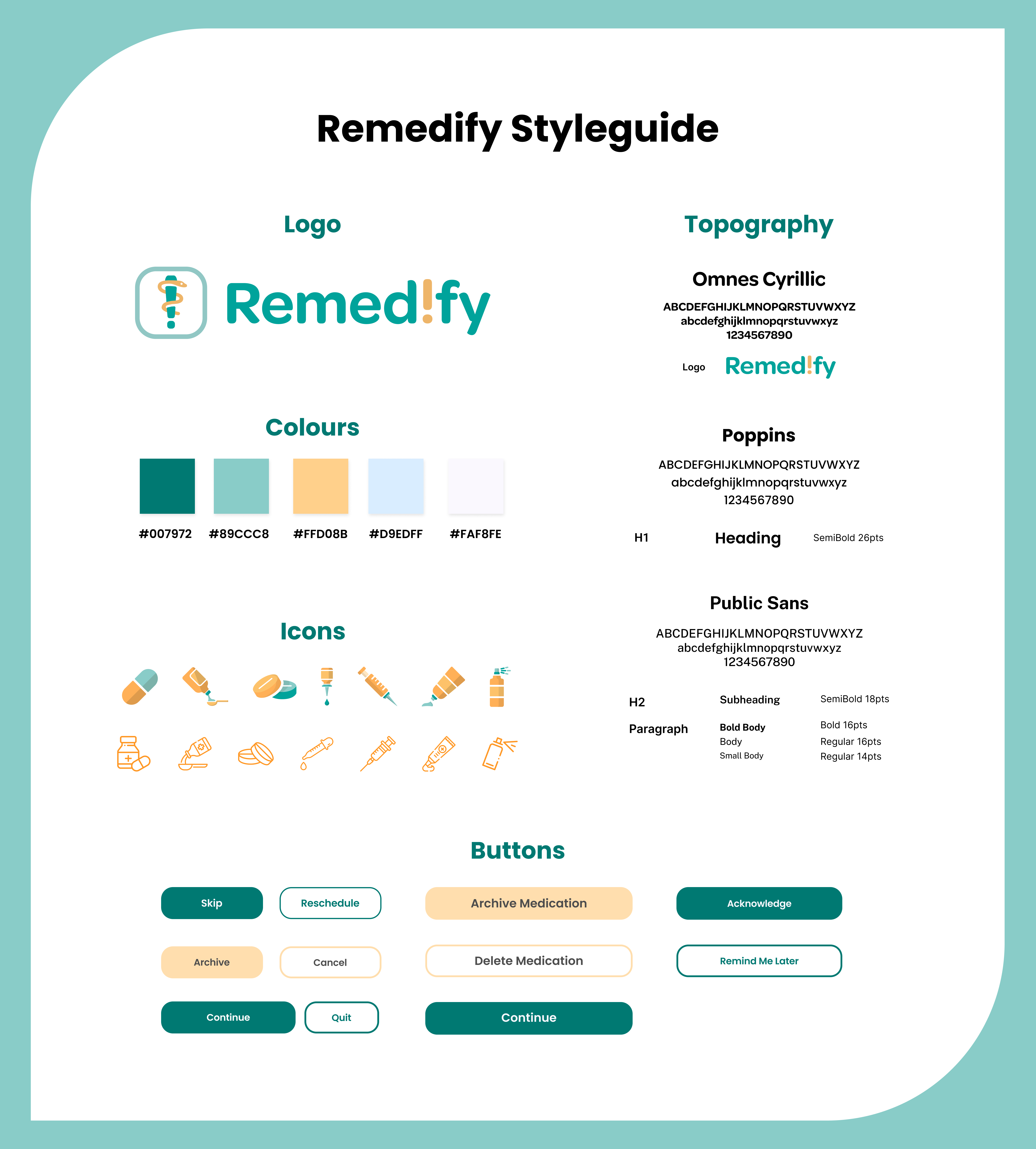
color palette
pine green
rgb (0, 121, 114)
#007972
light green
rgb (137, 204, 200)
#89CCC8
sunset
rgb (255, 208, 139)
#FFD08B
light blue
rgb (217, 237, 255)
#D9EDFF
silver white
rgb (250, 248, 254)
#FAF8FE
The color palette is designed to create a balance between vibrancy and calm, enhancing both visual appeal and usability. Warm oranges introduce energy and positivity, making the interface feel inviting and engaging. In contrast, light green and blue provide a sense of calm and reassurance, reinforcing the app’s focus on health and well-being. A neutral silver-white background adds a layer of simplicity and cleanliness, ensuring that the primary and secondary colors stand out without overwhelming the user. This thoughtful combination creates a visual synergy that is both approachable and functional, promoting clarity while maintaining a welcoming atmosphere.
remedify's logo
The Remedify logo was designed to merge symbols of health and reminders into a single, cohesive mark. After several iterations created by several members of the design team, the final concept features an exclamation point for alerts, with a snake winding up its length to evoke the Rod of Asclepius, a nationally known symbol of health and medicine. Simple shapes and white space techniques create depth while keeping the design minimal and friendly. The logo is unified by Remedify’s teal and sunset-inspired color palette, reinforcing warmth, trust, and accessibility.
typography
Remedify’s typography was carefully chosen to create a welcoming and user-centered experience while ensuring clear visual hierarchy and readability. The selection of rounded and approachable typefaces reinforces the app’s friendly and inviting design, making interactions feel intuitive and accessible. By using a structured combination of fonts for headings, buttons, and body text, the design maintains a balance between warmth and clarity, guiding users seamlessly through the interface.
omnes cyrillic
ABCDEFGHIJKLMNOPQRSTUVWXYZ
abcdefghijklmnopqrxtuvwxyz
1234567890
Omnes Cyrillic was used for Remedify's wordmark, selected for its rounded and inviting appearance

poppins
ABCDEFGHIJKLMNOPQRSTUVWXYZ
abcdefghijklmnopqrxtuvwxyz
1234567890
Poppins is utilized as a secondary typeface as a header and button font.
H1
Heading
SemiBold 26pt
public sans
ABCDEFGHIJKLMNOPQRSTUVWXYZ
abcdefghijklmnopqrxtuvwxyz
1234567890
Public Sans was selected as a tertiary typeface, used as body copy to establish clear visual hierarchy
H2
Subheading
SemiBold 18pt
Body Copy
Bold Body
Body
Small Body
Bold 16pt
Regular 16pt
Regular 14pt
iconography
Several custom icons were designed to represent different types of medications, incorporating the app’s color scheme and utilizing large, clear shapes with a friendly, rounded aesthetic. These icons enhance accessibility and make it easier for users to sort medications within complex schedules. Additionally, custom graphics were created for the scan screen, providing a clear visual guide to help users navigate the app’s scanning feature effortlessly.
wireframing
The wireframes were designed to outline the app’s structure and user interactions. Insights from the competitive analysis played a key role in shaping a user-friendly experience that aligns with the needs of the target audience. The wireframe provides a clear representation of how users will navigate and interact with each feature, ensuring seamless usability and intuitive design.
lo-fi wireframes
hi-fi wireframes
promotional materials
A variety of marketing materials were developed to support the promotion of Remedify, including business cards, brochures, and a promotional advertisement video. The brochure, carefully designed in Adobe InDesign, effectively communicates the app’s purpose, key features, and target audience in a visually engaging format. Meanwhile, the advertisement video was crafted to tell a compelling visual story, illustrating the real-world impact of Remedify through the lens of a potential user. By focusing on narrative-driven marketing, these materials aim to highlight the app’s value and connect with audiences on a deeper level.

motion design
To enhance engagement and visual appeal, motion graphics were incorporated into Remedify’s logo and medication scanning screen. These animations add a dynamic touch to the user experience while reinforcing the app’s friendly and approachable design. Created using Adobe After Effects, the animations were carefully crafted with Remedify’s existing graphic assets, ensuring consistency with the app’s visual identity. Designed with accessibility in mind, these motion elements provide intuitive cues that help guide users while making interactions feel more seamless and engaging.
